Creating a great developer portfolio website to showcase your work is an excellent idea. It allows potential employers and clients to get a sense of your skill set and previous work in an easy-to-digest format.
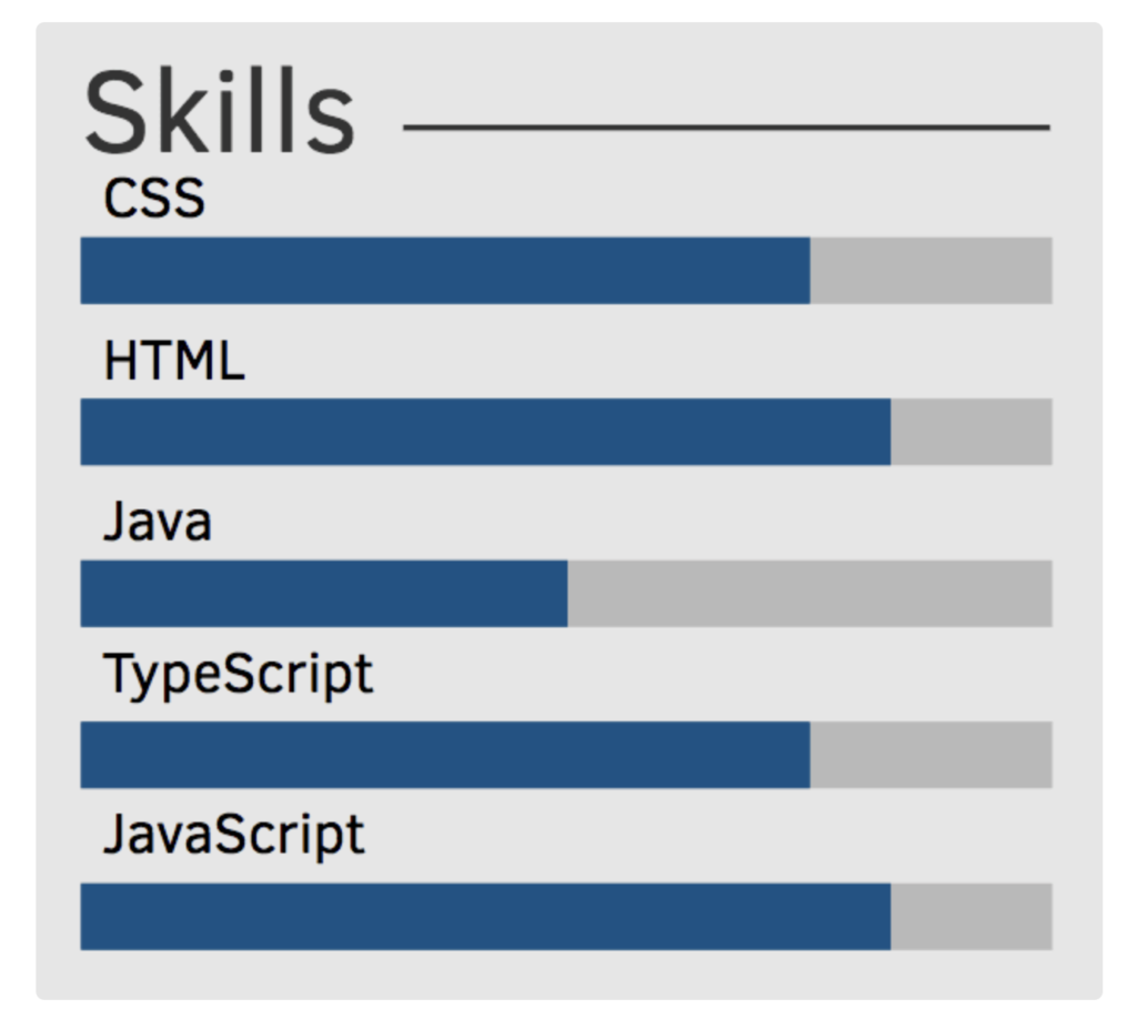
I often see developer portfolios that list skills with some sort of visualization like the above, or perhaps in the form of a dial with a percentage. Ultimately this is a subjective design decision…. but personally… I wouldn’t use these sorts of visualizations.
The problem is that they often don’t convey enough information to make them useful. Often times all they are conveying is the developer’s subjective assessment of their own capabilities relative to one another. Nobody is really “100% skilled” at JavaScript or “full bar skilled” at Java. What’s often the case is the developer is signalling their relative confidence with each technology. Developers often suffer from imposter syndrome and may even be selling themselves short!
My suggestion is to focus more on portfolio projects than anything else, listing the skills utilized in each project beneath the project.
But if you are going to use a visualization, my suggestion is to try to ground it in something less subjective, like perhaps years of experience or projects completed. So that way each bar or dial’s “progress level” represents relative years of experience or number of projects completed. This way the information conveyed is less subjective and less tied to your own self-assessment, and grounded in something more tangible.
